Americans Consume Less Energy in 2019
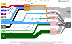
In 2019, Americans used less energy than in 2018, according to the most recent energy flowcharts released by Lawrence Livermore National Laboratory (LLNL).
Each year, LLNL creates flowcharts that show how the nation generates and uses energy. Americans went through 100.2 quads (quadrillion BTU), which is 1 quad less than last year. The most energy used in a year was the previous year, 2018, when 101.2 quads were consumed. (A BTU, or British Thermal Unit, is a unit of measurement for energy; 3,412 BTUs is equivalent to 1 kilowatt-hour, which would light an efficient LED lightbulb for a week.)
For the second year in a row, the largest increases in energy supply came from natural gas (up 4%), wind (up 10%) and solar (up 8%). Solar energy supply exceeded 1 quad for the first time ever, given record usage. Wind and solar combined generated more electricity than hydroelectric power, which had dominated the renewable-energy sector for decades.
“Solar and wind continue to show year-on-year growth, which is an impressive change for the energy system,” said A.J. Simon, associate program leader for Water Security and Technologies at LLNL. “Other energy resources, such as hydropower, nuclear energy and geothermal have trended flat over the past decade, despite visible annual fluctuations.”
Supply from natural gas increased by 1.1 quadrillion BTU, from 31 in 2018 to 32.1 in 2019, a 4% increase. Coal use declined 1.9 quads (14%), mostly in the electric generation sector, due mainly to the uptick in natural gas.
The shift from coal to gas also contributed to a drop in rejected energy, thanks to the higher efficiencies of natural-gas powered plants.
All energy use and conversion results in some losses, labelled on the chart as rejected energy. Last year, rejected energy was one 1 quad less than in 2018. This energy is usually waste heat, such as the warm exhaust from automobiles and furnaces. The efficiency of the nation’s cars, lightbulbs and factories determines how much waste heat is created, and how much fuel and electricity can be put to productive use.
Energy use in the residential, commercial, industrial and transportation sectors didn’t move much from 2018 levels.
LLNL devised the first of these diagrams (also referred to as Sankey diagrams) illustrating U.S. national commodity use in the mid-1970s. It makes similar diagrams that chart carbon dioxide and water flows at the international, state, municipal and organizational (e.g., Air Force) level. The flow charts help scientists, analysts and other decision-makers visualize the complex interrelationships involved in managing the country’s resources.


